Good app icon design starts with one fact: the icon is the one asset that follows a shopper everywhere. It shows in App Store search, on your product page and on the Today, Games and Apps tabs, then on the Home Screen (Apple Developer, Product Page Optimization). Yet in 2025, 69% of top App Store apps never changed their icon, and around 90% never A/B tested it (AppTweak, ASO & Apple Ads Trends & Benchmarks Report 2026).
The rules changed twice in 15 months. Dark and tinted icons arrived with iOS 18 in 2024 (Apple HIG change log, June 10, 2024). Then Liquid Glass, announced June 9, 2025, made iOS 26 icons layered glass and added clear looks (Apple Newsroom, 2025). iOS 27, released September 14, 2026, changed how those layers render. On Android, Play now rounds store icons to a 30% corner, and Android 16 QPR2 themes icons for you.
Below: the 2026 specs for both stores, eight design rules for every appearance, the Icon Composer build, and icon testing on each store. The icon is one lever among several; our hub covers the rest of the conversion funnel.
Key Takeaways
- iOS wants one 1024×1024 px layered icon, shown in six appearances (Apple HIG, 2026).
- Google Play wants a 512×512 px opaque square, which Play rounds to a 30% corner.
- In 2025, around 90% of top App Store apps never tested their icon.
- An iOS icon test starts one release early: treatments must ship in your live build first.
Where does your app icon appear, and why does it matter for conversion?
Apple calls the icon "one of the first elements of your app that users see," and it sits in every search result (Apple Developer, Creating your product page). In 2026, Apple Ads says over 850 million people visit the App Store weekly. Citing 2022 data, it adds that almost 65% of downloads happen directly after a search (Apple Ads, Ads on the App Store, 2026).
The icon travels well beyond search. On Google Play, it shows on "your store listing, search results, and top charts" (Play Console Help, Add preview assets). After install, Apple's HIG lists the Home Screen plus "notifications, system settings, and share sheets." It's the shape people hunt for when they come back.
69%
of top App Store apps never changed their icon in 2025
~90%
never A/B tested their icon on the App Store
~3 in 4
never tested their icon on Google Play
Games are the exception: more than half of top games updated their Play icon in 2025, per the same report. Outside games, an icon test is an open lane. Why leave the one asset shown everywhere untested?
iOS 27 adds a product page header and a search results asset near the icon. Our guide to iOS 27's product page header and search asset covers how they pair with it.
Neither Apple nor Google calls the icon a ranking factor. Treat it as a tap-through rate and conversion lever. Our app icon glossary entry covers the basics.
What are the App Store icon requirements in 2026?
For iPhone, iPad and Mac, Apple's layout is a 1024×1024 px square of layered artwork, masked to a rounded rectangle. It renders in six appearances: "Default, dark, clear light, clear dark, tinted light, tinted dark" (Apple HIG, App icons, 2026). Apple Watch uses 1088×1088 px under a circular mask, and Apple TV an 800×480 px rectangle.
| Platform | Canvas | Shape after masking | Layers | Appearances | Built with |
|---|---|---|---|---|---|
| iOS, iPadOS, macOS | 1024×1024 px | Rounded rectangle | Layered | Default, dark, clear light, clear dark, tinted light, tinted dark | Icon Composer, or an asset catalog |
| watchOS | 1088×1088 px | Circle | Layered | Not applicable | Icon Composer, or an asset catalog |
| visionOS | 1024×1024 px | Circle | Background plus one or two layers, 3D | Not applicable | Asset catalog |
| tvOS | 800×480 px | Rounded rectangle | Two to five parallax layers | Not applicable | Asset catalog |
Icon Composer builds one multilayer .icon file that covers iOS, iPadOS, macOS, watchOS and the App Store. Adding it to Xcode replaces your AppIcon asset catalog, and Xcode generates a look-alike for releases before iOS 26 (Apple, Creating your app icon using Icon Composer). As of September 28, 2026, Icon Composer "requires macOS Tahoe 26.4 or later" (Apple, Icon Composer).
Flat artwork still ships. Apple accepts a flattened image, though layers give you the most control over the glass. An asset catalog still builds every size from one 1024×1024 px image. Add a dark variant on a transparent background and a grayscale tinted one (Apple, Configuring your app icon using an asset catalog).
What did iOS 27 change for app icons?
Apple's HIG change log for June 8, 2026 says only "Refined guidance for Liquid Glass." The concrete changes sit in Icon Composer. Refraction and new specular options apply from version 27, and Effects buttons compare 26 and 27 rendering. In versions "earlier than 27," "Refraction settings have no visible effect."
On the first iOS 27 beta, MacRumors reported "multiple distinct Liquid Glass layers" in icon artwork and no gyroscopic specular highlight (MacRumors, June 16, 2026). Treat those as beta-era details. At the September 14 release, it called icons "sharper and more detailed" (MacRumors, September 2026).
People still on iOS 26 see your icon without refraction, per Apple's Icon Composer docs. So never let a refraction effect carry the symbol. If the icon only reads with it, it won't read for them.
On the Mac, "irregularly shaped icons receive a system-provided background" (Apple, Adopting Liquid Glass). Vision Pro has its own rules; see round icons on Vision Pro. For the images beside your icon, see screenshot and preview specs for both stores.
Last verified against Apple's pages: September 28, 2026.
How do you design an app icon that holds up in Liquid Glass and every appearance?
Apple's advice fits in one line. Express one idea "with a minimal number of shapes" on a simple background, and let the system add the glass (Apple HIG, 2026). Then test the hardest rendering, since "dark icons are more subdued, and clear and tinted icons are even more so." Eight practices follow.
- One idea, few shapes, simple background. A solid color or gradient is enough, and the art doesn't have to fill the canvas.
- Design in layers. Stack filled, overlapping shapes with crisp edges, not feathered ones, and vary opacity for depth.
- Don't bake in effects. Leave highlights, shadows, bevels, blurs and glows to the system; its effects respond to light, while yours "are static." Google Play wants no baked corners or shadows either.
- Keep text out unless it's essential. Icon text "doesn't support accessibility or localization," and words like "Watch" or "Play" add nothing.
- Illustrate, don't photograph. Apple prefers illustrations to photos, and very thin lines lose detail at small sizes. Skip copies of UI and replicas of Apple hardware.
- Center the symbol on square, unmasked layers. The system masks the edges itself, and pre-masked layers make "edges look jagged." Android's version of this rule is the 66 dp safe zone.
- Keep features consistent across appearances. Swapping elements between variants makes your app harder to find when people switch looks. Base the dark icon on the light one.
- Stress-test in mono (our house rule). Preview clear and tinted, light and dark, over a real wallpaper at small size. If the symbol fades, simplify.
One sample icon, six appearances: what to check
iOS users pick the appearance, and "the system automatically generates variants you don't provide" (Apple HIG, 2026). Android 16 QPR2 auto-themes icons without a monochrome layer. So make the monochrome render your stress test: if the symbol reads in tinted dark at Home Screen size, it reads everywhere.
For the store view, drop your flat render into our free Store Page Preview. It shows your icon in App Store and Google Play layouts, with Play's 30% mask, right in your browser. It doesn't simulate the Liquid Glass appearances, so use Icon Composer's preview for those. Game teams should also read about icon choices for games.
- On an iPhone running iOS 27, switch your Home Screen to default, dark, clear dark and tinted dark in turn.
- In each look, screenshot your icon beside your three closest competitors.
- Score three yes/no checks per icon. Does dark look designed, not auto-darkened? Is the symbol clear in tinted dark? Does any text survive?
- Have two people score on their own, then settle disagreements.
- Fix every "no" before you spend a test slot on the icon.
This is a protocol for you to run. We're not publishing results from it here.
How do you build the icon in Icon Composer and ship it without upload errors?
Export layers as SVG, import them into Icon Composer and organize them into "a maximum of four groups." Tune each group's Liquid Glass settings and check the default, dark and mono previews. Then add the .icon file to Xcode (Apple, Creating your app icon using Icon Composer, 2026). Here it is in seven steps.
- Set the canvas: 1024×1024 px for iPhone, iPad and Mac, or 1088×1088 px for Apple Watch.
- Split the art into layers. Number layers back to front, and convert text to outlines, because SVG doesn't keep fonts.
- Export. Use SVG where you can and PNG for the rest. Leave out the canvas mask, since the system applies it.
- Import and group, four groups at most. Per group, set Individual or Combined mode, Specular (Off, Automatic, Inside or Outside), Blur, Refraction, Translucency and Shadow.
- Check the appearances. Icon Composer previews default, dark and mono. For clear and tinted, click Mono, then Options.
- Compare generations with the Effects buttons, 26 then 27, at small sizes too.
- Add it to Xcode. Drag in the
.iconfile. Under App Icons and Launch Screen, match the App Icon field to its name, minus the extension.
Anatomy of a Liquid Glass icon in Icon Composer
In August and September 2025, developers reported ITMS-90717 rejections for Icon Composer icons: the large icon "can't be transparent or contain an alpha channel." The reported trigger was Blur on a group with an SVG near the canvas edge. Turning Blur off fixed it (Apple Developer Forums, thread 795411). Those reports came from Xcode 26 betas and the release candidate, and we haven't confirmed the bug in Xcode 27.
One last choice: older releases get Xcode's generated look-alike by default. To keep your old icon there instead, Apple says to "continue to use asset catalogs."
What does Google Play require for the store icon and the launcher icon?
Google Play needs two icons. The store icon is a 512×512 px, 32-bit PNG in sRGB, up to 1024 KB, uploaded as a full square. Play applies a corner radius "equivalent to 30% of icon size" and a shadow (Google Play icon design specifications, updated June 15, 2026). The launcher icon ships inside your app as an adaptive icon.
Don't bake in corners or shadows, and keep the background opaque, since transparent areas show Play's own background color. Play Console accepts a "32-bit PNG (with alpha)," so transparency uploads but shows through (Play Console Help, Add preview assets). Minimal art can run full bleed; logos sit on the keyline grid.
Skip anything that suggests ranking, deals or a Play program. The Metadata policy also bans "misleading symbols," like a "new message dot indicator when there are no new messages" (Google Play Policy Center, Metadata). Keep both icons in one family, too. Google calls the store icon "a higher-fidelity, higher-resolution version" that doesn't replace the launcher icon.
How much does the 30% corner mask cut?
Google's 2019 spec used a 20% radius (Android Developers Blog, March 15, 2019). The current page says 30% but gives no effective date. The March 31, 2026 date in third-party posts has no Google source we could find. Art built on 20% templates can lose corner detail.
By our arithmetic, a 30% radius on a 512 px icon is 153.6 px. The mask clips about 7.7% of the square, versus about 3.4% at 20%. Along each diagonal, the curve sits about 64 px in from the corner, so keep text and fine detail out of that zone.
Google Play's two icons: the 30% store mask and the adaptive safe zone
What does the adaptive launcher icon need?
Size every layer at 108×108 dp. Only "the inner 66x66 dp" is safe from masking, and the outer 18 dp on each side is reserved for masks and motion effects. Use a 48 to 66 dp logo (Android Developers, Adaptive icons, updated September 22, 2026). Device makers supply their own masks, so the safe zone is all you can count on.
Users still decide whether to turn on themed icons. What you've lost is the opt-out.
On Android 13 and later, themed launchers tint icons that include a monochrome layer. From Android 16 QPR 2, "Android automatically themes app icons for apps that don't provide their own," per the adaptive-icon docs. Google's blog says it applies "a color filtering algorithm" to your launcher icon (Android Developers Blog, August 20, 2025).
Google Play's Developer Distribution Agreement, effective September 15, 2025, also licenses users to "modify color of, or add themes to" your icons (Google Play DDA, §5.3). So ship your own monochrome layer rather than leave it to a filter.
| App Store (iOS, iPadOS, macOS) | Google Play | |
|---|---|---|
| What you supply | One .icon file, or a 1024 px image in an asset catalog | A 512 px PNG in Play Console, plus an adaptive icon in your app |
| Canvas | 1024×1024 px | 512×512 px store icon; 108×108 dp launcher layers |
| Who rounds and adds effects | The system: mask, specular, blur, shadow | Play: 30% corners and shadow. The launcher: each device's mask |
| Appearance or theming | Six appearances; the system fills any gaps | Themed monochrome from Android 13; automatic from Android 16 QPR2 |
| Where it lives | In the build | Store icon in Play Console; launcher icon in the build |
| What a change needs | A new app version | A listing change that goes through Play's publishing review; the launcher icon needs an app update |
Store icon edits go through Play's publishing flow. Processing "can take a few hours or up to seven days" (Play Console Help, Control when app changes are reviewed and published). For the rest of your Play listing, see our field guide. The feature graphic is the other Play-only visual, and the Google Play metadata policy covers both.
Last verified against Google's pages: September 28, 2026.
Which icon mistakes get rejected, and which quietly cost installs?
Rejections come from a short list of rules. Apple's App Review Guidelines, last updated June 8, 2026, want icons that "adhere to a 4+ age rating" (Apple, App Review Guidelines). Alternate icons must stay "similar to avoid creating confusion." The costlier mistakes pass review and quietly lose taps.
| Mistake | Store | Rule | Fix |
|---|---|---|---|
| Violent or mature imagery | App Store | 2.3.8: icons must "adhere to a 4+ age rating" | Use a non-graphic character or emblem |
| Alternate, Watch or small icons that don't match the main one | App Store | 2.3.8: keep icons "similar" | Vary color or style, not the concept |
| Another developer's icon or brand | App Store | 4.1(c); 2.3.9 on rights to materials | Get the developer's approval, or remove it |
| Other platforms' icons or imagery | App Store | 2.3.10 | Remove rival platform and store marks |
| Kid-targeting cues outside the Kids Category | App Store | Kids Category rule names the icon | Move to Kids, or change the art |
| Replicas of Apple hardware | App Store | HIG: "Don't use replicas of Apple hardware products" | Draw your own object |
| "#1," "Editor's choice," "10% off" | Google Play | Metadata policy; icon spec | Delete the badge or text |
| Fake notification dot | Google Play | Metadata policy: "misleading symbols" | Remove it |
| Baked-in rounded corners or shadows | Both | HIG; Google icon spec | Upload square art with no effects |
| Alpha channel on upload | App Store | ITMS-90717 | See the Icon Composer fix above |
Check these first. Do fine lines blur at search size, or does text become unreadable? Do your color and symbol match the top three results for your main keyword? Does a tinted render turn into a blank tile?
None of these triggers a rejection, but each can cost taps. They're part of the creative checks in our ASO audit, and our App Review Guidelines entry covers the rules side.
How do you A/B test an app icon on the App Store and Google Play?
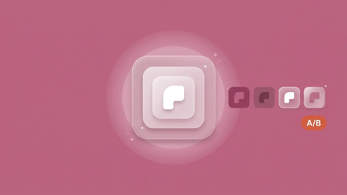
On iOS, Product Page Optimization tests up to three treatments for up to 90 days (Apple, Product Page Optimization, 2026). The catch is that each icon treatment must already sit in your live binary. On Google Play, a store listing experiment changes only the store icon, and it can run for up to six months.
How does an icon test work on iOS?
- Ship the alternates first. Test icons must be "part of the app binary currently on the App Store," at 1024×1024 px (App Store Connect Help, Configure test treatments). Build with Xcode 13 or later, and list them under the Alternate App Icon Sets build setting.
- Give each alternate its own appearances. Alternates "require their own dark, clear, and tinted variants," and all of them go through App Review (HIG).
- Configure the test. The App Icon tab appears only when the live binary holds more than one icon. Icon-only treatments need no resubmission.
- Know who keeps the icon. A treatment icon shows "on the user's device." Apple doesn't say what happens to those installs if you don't apply it.
- Apply, then ship. If a treatment with an alternate icon wins, include that icon in your next app version.
One wrinkle: Apple's alternate-icon docs now want "an Icon Composer file" for each alternate (Apple, Configuring your app to use alternate app icons). App Store Connect Help still says "alternate icons in asset catalogs." One developer found .icon alternates failing in Xcode 26 but working in Xcode 27 (Use Your Loaf, July 30, 2026). We haven't confirmed they appear in the PPO App Icon tab, so prove it on a low-stakes release.
An iOS icon test, from binary to winner
Every treatment is a full alternate icon, with its own variants, that must pass review inside a live build before the test can exist. So keep your icon-test backlog one version ahead of your test calendar.
Apple's own example hypothesis makes a good template: "Changing your app icon to a different style or color improves your conversion rate." Custom product pages can't carry a different icon. They vary "screenshots, promotional text, and/or app previews" (Apple, Custom product pages).
How does an icon test work on Google Play?
Play setup is simpler: default graphics experiments test "your app's icon, feature graphic, and screenshots," and the metric is unique user install clicks. Google's help page still allows "up to 2 variants" (Play Console Help, Run A/B tests on your store listing). On August 7, 2026, though, Phiture reported that since late July, multi-variant testing "appears to have been removed," leaving "standard two-way (A/B) testing" (Phiture, ASO Monthly #121). Check your console, and plan for one icon variant against your current one.
Outside experiments, custom store listings can carry their own icon. Google lets each one customize your app's "name, icon, descriptions, and graphic assets" for a chosen audience (Play Console Help, Create custom store listings).
Apple puts the treatment icon on the installer's device. A Play experiment changes only the 512 px store icon, which Google says doesn't replace the launcher icon, so variant installers find your current launcher icon at home. Keep variants recognizably yours, and ship a matching launcher icon if one wins.
| iOS Product Page Optimization | Google Play store listing experiments | |
|---|---|---|
| Where test icons come from | Alternate icons in the live App Store binary | Uploaded in Play Console |
| Review | Alternates reviewed with the build; icon-only treatments need no resubmission | Handled as store listing changes; managed publishing can hold them |
| What installers get | The treatment icon, on their device | Your current launcher icon (see above) |
| Shipping the winner | Include it in the next app version | Apply in Play Console, then ship a matching launcher icon |
What should you test, and when?
Test concepts, not shades: a character against an emblem, or a light background against a dark one. Small tweaks need more traffic than most apps have. For test caps, durations and sample sizes and when to stop a test, see our A/B testing guide; the glossary defines product page optimization and store listing experiments. Run every variant through the mono stress test first.
Seasonal icons follow the same clock. On iOS, a holiday icon ships with a version, so it needs a rollback build too. Our Q4 playbook covers seasonal swaps and the build clock.
How we plan it: the icon test goes on the release calendar first and the test calendar second. Design two or three alternates, put each through the appearance audit, and ship them in the next routine version. The test can then start the day that version goes live. That planning is part of our conversion optimization work.
Frequently asked questions
What size should an app icon be in 2026?
For iPhone, iPad and Mac, Apple uses a 1024×1024 px layered icon, and Apple Watch uses 1088×1088 px (Apple HIG, 2026). Google Play's store icon is a 512×512 px, 32-bit PNG of up to 1024 KB. Android launcher icons are adaptive, with 108×108 dp layers and an inner 66×66 dp safe zone (Google, 2026).
Do I have to use Icon Composer for my iOS app icon?
No. Apple still accepts a flattened icon, and an asset catalog still generates every size from one 1024×1024 px image. Icon Composer gives you control over how Liquid Glass renders your layers and your dark and mono looks, in one .icon file. Adding one replaces your AppIcon asset catalog in Xcode (Apple, 2026).
Do I need to design dark, clear and tinted versions of my icon?
Not for your main icon: Apple says the system "automatically generates variants you don't provide." Customizing dark and mono is still worth it, because dark icons render more subdued and clear and tinted ones even more so. Alternate icons, including PPO treatments, require their own dark, clear and tinted variants (Apple HIG, 2026).
Can you A/B test an app icon on the App Store?
Yes. Product Page Optimization tests up to three treatments against your current product page for up to 90 days. Each icon treatment must already be an alternate icon in the binary that's live on the App Store. People who install from a treatment get that icon on their device (Apple, 2026).
Can an app icon include text?
Apple advises including text "only when it's essential," because icon text "doesn't support accessibility or localization" and is hard to read at small sizes (Apple HIG, 2026). Google Play bans icon text or images that suggest ranking, price, promotions or Play programs, such as "#1" or "10% off" (Google Play Metadata policy, 2026).
How often should you change your app icon?
Rarely, and only after a test. In 2025, 69% of top App Store apps never changed their icon, though more than half of top games updated theirs on Google Play (AppTweak, 2026). On iOS, every change to the primary icon ships with a new app version, so plan it like a release.
The bottom line
App icon design best practices in 2026 come down to two habits: design for the hardest rendering, and plan tests a release ahead.
- iOS: one 1024 px layered icon, six appearances, built in Icon Composer. Check mono first.
- Google Play: a 512 px opaque square that Play rounds to 30%, plus an adaptive launcher icon with your own monochrome layer.
- Leave out effects, corners and most text.
- iOS tests start one release early: alternates, with their own appearances, ship in the binary first.
- On Play, a test changes the store icon, not the home-screen icon.
Put your icon into the free Store Page Preview to see it at search size on both stores. Then book a free 30-minute call, and we'll review your icon and first screenshots and plan an icon test one release ahead. The fixed-price ASO audit is the usual starting point.