Most teams treat app store conversion as a design problem they'll get to later. It's actually the most expensive number on your dashboard. Every install you buy through Apple Search Ads, every visitor your keywords earn for free, every tap from a paid social campaign — all of it lands on one product page, and your conversion rate decides how much of that effort survives the last seven seconds before the install button.
A visitor spends roughly seven seconds on your product page before deciding to install or leave, and the first three screenshots drive about 60% of that decision (Apple Developer, 2026; Digital Applied, 2026). This is the funnel-ordered playbook for increasing app conversion rate in 2026 — every lever that moves the number, ranked by impact, with what to change and what to test first.
Key Takeaways
- Conversion is a seven-second funnel decided mostly on the first three screenshots — Apple's own guidance puts them at ~60% of the install decision.
- Benchmark by category, not the ~25% global average: business apps clear 65% while games run 3–5% (Adapty, 2026).
- Ratings gate everything at the 4.0 cliff — moving from 3 to 4 stars can lift install conversion ~89% (Digital Applied, 2026).
- Preview video helps Games and Social (+20–35%) but can hurt Finance and Productivity. Custom Product Pages lift conversion 18–26% over the default page.
- Test in the order people decide — first screenshot first. Screenshot A/B tests deliver an ~11.8% median lift.
What is a good app conversion rate in 2026?
There is no single "good" number — category is everything. The Apple App Store averages around 25% and Google Play around 27.3%, but that hides an enormous spread: business apps clear 65%, music sits around 32%, games run in the 3–5% band, and iOS entertainment converts near 3.2% (Adapty, 2026; Business of Apps, 2026). Comparing your game's conversion rate against the global average tells you nothing.
Platform matters too. iOS conversion runs about 5.7 percentage points higher than Google Play, largely because the first three screenshots render above the fold on an iOS product page while Play surfaces the description and similar apps sooner (AppTweak, 2026). So before you decide your rate is "bad," anchor it twice: against your category and against your platform. A 20% business app is underperforming; a 6% game is doing well.
App Store conversion rate by category (iOS, 2026)
Knowing your real benchmark also tells you when to stop. If a category-leading rate is 30% and you're at 28%, the next gain comes from retention and pricing, not another screenshot test. If you're at 15% in a category that averages 30%, your page is the problem — and the rest of this guide is for you.
Why do the first three screenshots decide everything?
Because that's where the decision happens. Apple's product page guidance and the data around it show the first three screenshots drive roughly 60% of the install decision, and getting the first two right can add 25% or more to conversion (Apple Developer, 2026; Digital Applied, 2026). On iOS those frames render above the fold, so they're the single highest-leverage asset on the page. Change them before you touch anything else.
The rules that separate a frame that converts from one that doesn't are consistent. Lead with an outcome, not a feature: "Save an hour every day" beats "Smart scheduling engine," because the visitor is buying the result, not the mechanism. Stack a short headline at the top of the frame where the eye lands first — top-stacked captions tend to outperform bottom ones. Keep the text high-contrast and legible at thumbnail size, which has a useful side effect: Apple's screenshot OCR can read it, so a clean caption earns both conversion and keyword weight. A media logo or user count on the first frame — real social proof — can lift conversion meaningfully, by as much as 90% in some tests, though treat the high end of that range as a ceiling, not a promise.
Share of the install decision made on the first three screenshots
That dual job — convert a human and feed the algorithm from one caption — is why we fold keyword intent into screenshot and creative testing rather than treating creative and metadata as separate workstreams. It's also the most direct link between conversion and rank: a higher tap-to-install rate is itself a signal, which is part of why conversion is now a ranking factor, not just a vanity metric.
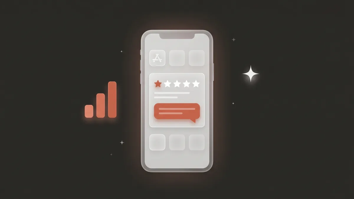
How much do ratings and reviews move conversion?
A lot — and the jump from 3 to 4 stars is the steepest part of the curve. Moving from a 3-star to a 4-star rating can increase install conversion by roughly 89%, and 4.0 is the threshold below which tap-through and download rates fall sharply (Digital Applied, 2026; Strataigize, 2026). Your star rating renders right beside the title and first screenshot, so it's part of the same seven-second glance — a low score quietly taxes every other improvement you make.
Three things protect the number. Volume and recency: a steady stream of recent reviews reads as current quality, and stale ratings lose weight over time. Timing: prompt for a review right after an "aha" moment — a completed workout, an exported file, a won game — not on cold launch. And response: replying to negative reviews recovers some of them and shows prospective users you're present. Because the rating sits at the top of the funnel, protecting it is one of the highest-leverage moves available, which is why we run ratings and reviews management as a core workstream rather than a cleanup task — see the full guide to App Store reviews for how to get more, reply, and recover.
Relative install conversion by star rating (5★ = 1.00)
Should you add a preview video — and when does it backfire?
It depends on your category, and this is where most generic advice gets it wrong. A well-made preview video can lift conversion 20–35% in retention-heavy categories like Games and Social, where motion sells the experience — but it can reduce conversion 3–7% in Finance and Productivity, where it adds friction in front of a clear, trust-led screenshot (Strataigize, 2026). "Always add a video" is bad advice; "test a video for your category" is the right rule.
If you do run one, the first two to three seconds decide everything. The most distinctive feature has to appear immediately — a splash screen, a loading spinner, or a login screen in the opening seconds and no one watches the rest. Design for sound-off autoplay, keep it inside the 15–30 second window Apple allows, and let the visuals carry the message without relying on audio. Apple's WWDC25 analytics update added a download-to-paid conversion metric, so you can now see whether a video that lifts installs also lifts the paying users behind them — measure that, not just the install bump. And WWDC 2026 went further still, putting video directly into App Store search results.
How do Custom Product Pages lift conversion per traffic source?
Your default product page is a compromise that fits no single visitor perfectly. Custom Product Pages — up to about 70 per app on iOS — let you match the creative to each campaign or audience, and CPPs tied to specific paid campaigns lift conversion 18–26% over the default page (AppTweak, 2026). The principle is message match: an ad that promises "save money" should land on a page whose first screenshot says "save money," not a generic feature tour.
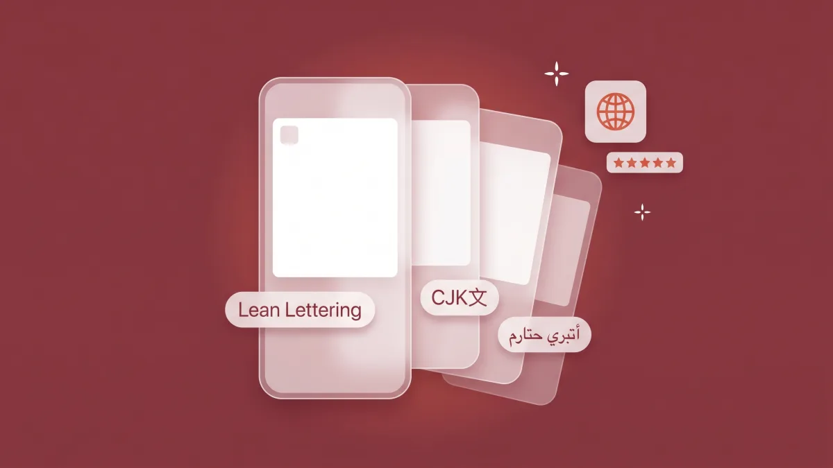
CPPs work for organic too — they can be assigned keywords and surface in search — but their highest return is on paid traffic, where you control the inbound message. Wire a dedicated CPP URL into each Apple Search Ads campaign routed to a matching Custom Product Page and into your paid social creative, then read per-CPP conversion in App Store Connect to see which message actually converts which audience. The same discipline extends across markets: localizing a CPP's creative, not just translating its text, is where localizing your store creative compounds with message match.
What should you A/B test first, and how?
Test in the order visitors decide: first screenshot, then icon, then preview video, then the second and third frames. Screenshot A/B tests deliver around an 11.8% median conversion lift — the highest-leverage test you can run on iOS, where screenshot changes move the first three frames 10–25% (AppTweak, 2026; Digital Applied, 2026). Icon tests deliver less on iOS but more on Google Play, where they lead at roughly 8–12%.
Run the native tools: Apple's Product Page Optimization supports up to three treatments against your default, and Google Play's Store Listing Experiments do the equivalent on Android. Two rules keep results honest. Change one variable per test — a new headline or a new background, never both — or you won't know what won. And let each test reach significance, which usually means at least a week of real traffic, before you call it. The most common conversion mistake is redesigning the whole page at once: it might lift the number, but you've learned nothing you can repeat. The single most reliable test to start with is a benefit-led versus feature-led first-screenshot headline; the framing of that headline is set up by the title and subtitle that frame your screenshots.
Conversion isn't a page — it's a seven-second funnel. Visitors decide in a fixed order: icon, first screenshot, caption, second and third frames, rating, video. So optimize and test in that same order, top of the funnel first. Pulling a lever out of sequence — polishing your fifth screenshot before fixing a 3.8 rating, or buying traffic before the page converts — is how teams spend effort without moving the number. Fix the funnel from the top, then pour traffic in.
How do localization and onboarding extend the funnel?
Conversion doesn't end at the install button. Two stages bracket the ones above, and ignoring them leaks the users you just paid to acquire. Upstream, localizing your first three screenshots — adapting the creative and captions to each market, not just translating the words — lifts in-market conversion and is part of why iOS, with its above-the-fold creative, already converts about 5.7 points higher than Play (AppTweak, 2026). A screenshot that converts in San Francisco may fall flat in Tokyo if the imagery and proof points weren't adapted.
Downstream, onboarding protects the download-to-active conversion that closes the loop. A page that funnels a hard-won install into a twelve-step signup or an immediate paywall throws away the very users your creative just earned. Fewer steps, value before the ask, and a delayed sign-up keep more of them — and because retention and active use feed back into ranking, a smoother onboarding quietly lifts the organic traffic that fills the top of the funnel. Conversion and retention aren't separate projects; they're two ends of the same pipe.
Which conversion lever should you fix first?
Start with the cheapest, highest-impact change and work down. The first-screenshot headline and a social-proof badge cost a day of design and move the biggest share of the decision, so they come first. Then your rating, if it's under 4.0 — nothing else matters as much while you're below the cliff. Then a category-appropriate preview video, tested against no video. Then Custom Product Pages to match each traffic source. Then localization and onboarding to extend the funnel at both ends.
One discipline ties it together: don't scale paid user acquisition or Apple Search Ads until your page converts at or above your category benchmark — conversion is the hinge the rest of your iOS app marketing swings on. Buying traffic for a page that leaks is the most expensive mistake in the playbook — you're paying full price for installs the page can't keep, and on iOS the weak conversion drags your organic position down with it. Stop the leak, then open the tap. If you'd rather have someone tell you which frame is costing you installs, that's the first thing a free CRO audit is built to find — and if you also ship on Android, why iOS converts higher than Google Play explains which of these levers transfer and which don't.
Frequently asked questions
What is a good app conversion rate in 2026?
It depends on category. iOS averages around 25% and Google Play around 27.3%, but business apps clear 65% while games run 3–5% and iOS entertainment sits near 3.2% (Adapty, 2026). Benchmark against your own category, not the global average.
What has the biggest impact on app conversion rate?
The first screenshot. Apple's product page guidance shows the first three screenshots drive roughly 60% of the install decision, and getting the first two right can add 25% or more (Apple Developer, 2026). On iOS they render above the fold, so they're the highest-leverage asset on the page.
How much do ratings affect app store conversion?
Significantly. Moving from a 3-star to a 4-star rating can lift install conversion roughly 89%, and 4.0 is the threshold below which tap-through falls sharply (Digital Applied, 2026). The rating sits beside your first screenshot, so a low score taxes every other improvement.
Does a preview video increase app downloads?
In the right category. Video can lift conversion 20–35% in Games and Social but reduce it 3–7% in Finance and Productivity (Strataigize, 2026). Always A/B test video against no video, and put your most distinctive feature in the first two to three seconds.
What should I A/B test first on my app store page?
The first screenshot. It carries most of the decision, and screenshot A/B tests deliver around an 11.8% median conversion lift — the highest-leverage test on iOS (AppTweak, 2026). Test in the order visitors decide and change one variable at a time.
The bottom line
Increasing your app conversion rate isn't a redesign — it's a sequence. The decision happens in about seven seconds, mostly on three screenshots, and the levers that move it have a natural order of operations:
- Benchmark against your category and platform first — a "bad" rate is only bad relative to peers, not the ~25% average.
- Fix the top of the funnel: a benefit-led first screenshot with social proof, then a rating above the 4.0 cliff.
- Add a preview video only where it helps your category, and use Custom Product Pages to match the page to each traffic source.
- Test in the order people decide — first screenshot first, one variable at a time — and extend the funnel with localized creative and frictionless onboarding.
- Scale paid acquisition last, once the page converts at or above benchmark, so you're not buying traffic it can't keep.