You picked a new market, exported your screenshot set, pasted the captions into a translator, and uploaded the results. Downloads barely moved, so you filed localization under "things that don't really work for us." The problem isn't localization. The problem is that you didn't localize — you translated, which is a different and much smaller job.
Here's the scale of what that costs you. Seven of the top 10 iOS markets, and 9 of the top 10 on Google Play, are non-English regions. An English-only product page is invisible to most of the world's app revenue. And localization moves numbers: in Distimo's 2012 study, iPhone apps that added their users' language saw downloads rise over 128% the following week. It's an old, one-week snapshot, but a telling one (Distimo, 2012). This is the market-by-market playbook for localizing your app store screenshots in 2026: what to adapt, in what order, and how to climb from translation to true cultural fit.
Key Takeaways
- Localization is a ladder — translate → localize → culturalize — and most teams stop at rung one and conclude it "didn't work."
- The famous +128% download lift is a one-week 2012 Distimo snapshot of ~200 iPhone apps adding the native language, and iPad apps saw no significant growth. Treat it as direction, not a forecast (Distimo, 2012).
- Localize the first three screenshots first — they render above the fold on iOS and carry most of the install decision.
- Start with caption text, then in-app UI, then imagery; localized on-image text alone captures most of the install lift from full-listing localization (Digital Applied, 2026).
- Keep the brand constant and flex the message the way Tinder does — direct in the US, formal in Japan, casual in Mexico (AppTweak, 2026).
Translate or localize — what's the real difference?
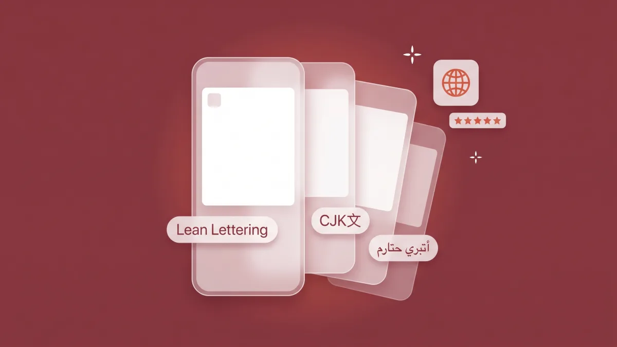
Translation swaps words. Localization adapts the creative. Culturalization adapts the message. Think of it as a ladder. Rung one converts your caption from English to German. Rung two makes that German screenshot actually work: text that fits the frame, UI shown in German, imagery that reads as local. Rung three asks the harder question. Is "save time" even the value a German user cares about, or should this market hear "stay in control"? A set that stops at rung one can read as foreign even when every word is correct.
The most common failure is mechanical, not strategic: text expansion. The same sentence runs about 30% longer in German, a little longer in French and Spanish, and far more compact in Japanese and Chinese (YellowHEAD, 2026). A caption that fit beautifully in English overflows its frame in German. It gets truncated, and quietly tanks the very screenshot you were counting on. Arabic and Hebrew add right-to-left layout on top. Word-for-word translation ignores all of this. That's why machine-translated captions so often read as generic, or break outright.
Caption length vs. English (relative, by language)
Getting this right is the foundation of localizing your store creative — and it's why we treat translation as the first step of the job, never the whole of it.
How much do localized screenshots actually lift downloads?
Likely a lot, though the famous number is older and narrower than it looks. The +128% comes from Distimo's September 2012 report on around 200 iPhone apps that added the native language that August, comparing one week after with one week before. Downloads rose over 128% and revenue about 26%, while iPad apps saw no significant download growth. Distimo itself wrote that crediting the language alone "is hard to tell" (Distimo, 2012). Localized screenshot text alone captures most of the install lift from full-listing localization (Digital Applied, 2026), so localizing screenshots returns more, faster, than localizing body copy.
That ordering matters for your roadmap. Visual assets often move conversion faster than text fields like the description, because they're what a scrolling visitor actually looks at. So on entry to a new market, the highest-return sequence is creative first, description second. That's the reverse of how most teams, anchored to keyword fields, instinctively work. Treat the 128% as direction, not a forecast: it measured a single week, on iPhone, in 2012. Localized screenshots are one lever; custom product pages for global expansion show how to build dedicated listings for each market you enter.
Change one week after adding the native language (Distimo, 2012)
If your non-English listings are underperforming today, this is usually the fastest win available. It's also a good place for a free localization audit to point at the markets leaking the most installs. For the full conversion mechanics those localized frames plug into, see how to increase your app conversion rate.
Which screenshots should you localize first?
The first three — the same rule that governs conversion optimization. On iOS those frames render above the fold and carry most of the install decision. So localizing their caption text is the highest-leverage move you can make in a new market (theAppLaunchpad, 2026). Prioritize the first two to three screenshots before anything deeper in the set. That's where global conversion lift concentrates.
Within those frames, work in order of impact per effort. Localize the caption and on-image text first, then the in-app UI shown inside the device frame, then the imagery itself. Keep the localized text high-contrast and legible at thumbnail size. Export every locale at the current App Store and Google Play screenshot sizes. That helps the human reader, which is the caption's first job. Whether Apple also reads caption text for search is contested: Appfigures reported it in June 2025, but ConsultMyApp's test of 64 caption phrases found only one ranking that existing metadata couldn't explain, and Apple hasn't confirmed it (Appfigures, 2025; ConsultMyApp, 2025). Treat any in-market keyword weight as a bonus. And watch the overflow: a localized headline that wraps to three lines, or gets cut off, does more damage than the English original it replaced. The localized title and subtitle set this up, so the way you spend your app title's characters should be revisited per locale, not copied across.
Non-English share of the top 10 iOS markets
Do you need to localize the images, or just the captions?
Start with the captions. They capture most of the available lift for the least effort: localized on-image text alone accounts for most of the install lift from full-listing localization (Digital Applied, 2026). The caption is also the part of a screenshot a scrolling visitor actually reads, so it's the right first move. For the long tail of smaller markets, well-translated captions over your existing visuals may be all the localization that's worth doing.
But don't stop there in markets that justify more. Sometimes the script, the aesthetic, or the people in your imagery differ sharply from your home market. There, localized UI and imagery compound the gain. Showing the app interface in the local language builds trust, and visuals that fit local taste convert better than a transplanted hero shot. An image that performs well in one country can underperform in another. Color symbolism, the models you show, and the scenarios you depict all carry meaning. So tier the effort: full creative localization for your biggest one or two markets, caption-only for the rest. That discipline is the heart of localizing store creative without drowning in 20-locale production.
How do you culturalize tone without breaking your brand?
Keep the visual system constant and flex the message. The brands that localize well lock their logo, palette, and layout grid, then let copy and value proposition move by market. Tinder runs consistent global visuals but adapts its tone: pragmatic and direct in the US, bold and contemporary in Germany, formal and neutral in Japan, casual in Mexico. Revolut goes further and swaps the value proposition itself, leaning on Bizum integration in Spain and "reimagine your salary" in France (AppTweak, 2026). Same brand, different argument.
The practical move is to split your screenshot elements into two buckets. Brand-constant: logo, colors, layout, the device frame. Market-variable: headline tone, the featured feature, the social proof you show, and the core value claim. Write a short localization style guide that names what's locked and what's free, so a translator or in-market reviewer can adapt tone without drifting from the brand. This is also where literal translation fails most visibly — idioms and wordplay that delight at home turn confusing or flat abroad, so brief writers to convey the intent, not the words.
Localization is a ladder, not a checkbox: translate the words, localize the creative, culturalize the message. Each rung returns more than the last — and each costs more (here's what each rung costs). Most teams climb rung one, see a small bump, and quit. The win lives on rungs two and three: a German screenshot whose text actually fits and whose argument actually matches what German users value. Decide per market how high you'll climb, and go all the way up for the markets that matter.
How do you learn what messaging wins in a new market?
Read your local competitors' screenshots — not the global leaders'. The message that converts in a market is often locked inside an image, in a language you don't read. Top-performing Korean games, for example, fill their screenshots with dense, benefit-led Hangul copy — angles that are completely invisible to anyone who can't read the creative (AppTweak, 2026). Copy the global category leader's English approach into Korea and you'll miss what actually moves Korean users.
The old way to crack this was slow. You'd upload competitor creatives into a chatbot, juggle translation tools, or wait on a native speaker to read a market's top listings one screenshot at a time. Translating competitor screenshots in bulk turns that into same-day research. You build a per-market messaging map of the hooks, proof points, and value claims local leaders actually use. Then you write your own captions against real evidence instead of guesswork. It's the fastest way to know what to say before you spend on saying it. And it pairs naturally with a broader read of how each store ranks and rewards localized listings.
What's the screenshot localization workflow, step by step?
Design the master set once, then branch per locale. The workflow that scales is: (1) finalize your source first-three screenshots; (2) localize the captions with native review, not raw machine output; (3) auto-fit the text for expansion and right-to-left layout so nothing overflows; (4) localize the in-app UI and imagery for your priority markets, and localize your product page header too; (5) upload per-locale sets to App Store Connect and Google Play Console (and add iPhone Duo sets to your localization plan); (6) A/B test the localized set against your control. Modern tooling now auto-adjusts text boxes, spacing, and typography so German, Japanese, and Arabic each render cleanly without hand-rebuilding every frame.
Two rules keep it honest. First, native review beats raw machine translation every time. A fluent reviewer catches the idiom, the awkward formality, and the cultural misfire a model won't. Second, test — don't assume. Run Apple's Product Page Optimization or Google Play's Store Listing Experiments to confirm the localized set actually beats the control. Occasionally a strong English brand outperforms a clumsy localization, and you want to know that before you roll it out. The mechanics differ by store, which is the practical reason App Store and Google Play localization don't work the same way. Plug the winning sets into your screenshot and creative testing cycle so localization becomes continuous, not a one-time launch chore.
Which localization move should you make first?
Start with your single biggest non-English market. Localize the first three screenshots' caption text there first — highest impact, lowest effort. Then add localized UI and imagery for that same market, and repeat for the next one down your revenue list. The instinct to fan out across 20 locales on day one is the wrong one. You get more from going deep on your top market than shallow across many. One fully culturalized market usually beats a dozen machine-translated ones.
So the order of operations is simple. Pick your biggest non-English market, or check our ranking of which languages to localize first. Localize the first three captions, review them with a native speaker, and fit the text. Then layer in UI and imagery, and test against your English control. Climb the ladder one market at a time. And if you'd rather have someone tell you which markets are leaking the most installs, and how deep to localize each, that's exactly what a free localization audit is built to find.
Frequently asked questions
What's the difference between translating and localizing app screenshots?
Translation swaps words; localization adapts the creative (text fit, UI language, imagery) to each market; culturalization adapts the message itself to local values. Word-for-word captions miss idiom, text expansion, and cultural cues, so a translated-only set can read as foreign even when every word is correct.
How much do localized screenshots increase downloads?
Likely a lot, but the famous number is older and narrower than it looks. The +128% download figure comes from a 2012 Distimo study of about 200 iPhone apps that added the native language, comparing one week after with one week before. Revenue rose about 26%, iPad apps saw no significant download growth, and Distimo said it was hard to tell whether the language alone caused the lift (Distimo, 2012). Treat it as direction, and measure your own before-and-after conversion in each market.
Which app store screenshots should I localize first?
The first three. They render above the fold on iOS and carry most of the install decision, so localize their caption text before the description or the imagery (theAppLaunchpad, 2026). Captions first, then in-app UI, then imagery.
Do I need to localize the images or just the captions?
Start with the captions. The caption is the part of a screenshot a visitor actually reads, and localized on-image text alone captures most of the install lift from full-listing localization (Digital Applied, 2026). Add localized UI and imagery for your largest markets, where distinct scripts and aesthetics compound the gain.
How do I know what messaging works in a new market?
Read local competitors' screenshots, not global ones. Translating their on-image text reveals market-specific hooks — like the dense, benefit-led copy of top Korean games — before you write your own (AppTweak, 2026).
The bottom line
Localizing your screenshots isn't a translation job you hand off and forget. It's a ladder you climb market by market:
- Translate is rung one; localize (fit the text, adapt the UI and imagery) and culturalize (adapt the message) are where the lift actually lives.
- Localize the first three screenshots first — captions, then in-app UI, then imagery — because that's where the install decision is made.
- Keep the brand constant and flex the message the way Tinder and Revolut do; write a style guide that names what's locked and what's free.
- Read local competitors' screenshots to learn what actually wins in a market before you write your own captions.
- Go deep on your biggest non-English market before going wide, review with native speakers, and test the localized set against your English control.